“Minimalism is achieved by reducing a design to only the most essential elements.” -Cameron Chapman
Today, minimalism is one of the most popular design principles used in the web design world. It is grasped by super-companies like Apple, creating a highly recognizable, simple branding. The minimalist designs used to design this desktop wallpaper and movie poster utilized many key principles of the design aspect. The key principle used was “less is more.” In both the desktop wallpaper and the movie cover, only the most essential elements were included while all extraneous design was removed.
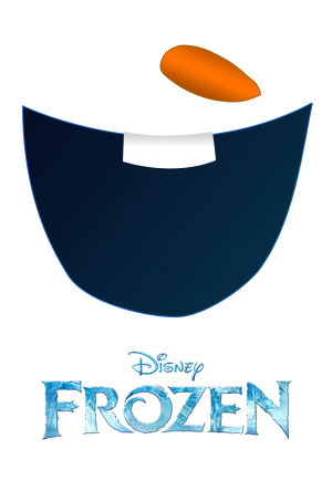
Minimalist movie poster for Disney’s Frozen.
As for the movie poster, a 300 x 400 pixel canvas was used to imitate an actual movie poster, according to IMDb. Olaf was specifically used because he is easily recognizable and often the audience’s favorite character. Originally the movie poster had included all of Olaf’s coal buttons, his shading, and his eyes. After “subtracting until it breaks” as Cameron Chapman suggests in his article Principles of Minimalist Web Design, these elements were considered extraneous and were removed. Additionally, when designing this movie poster, the actual logo was included because it provided easy identification with the movie. It would have been preferred to have a two-dimensional logo without the different coloring within the words to match with the rest of the poster’s two-dimensional nature. The 2D approach was used to emulate identifiable traits of Olaf without over-complicating the design elements. Originally, the quote “From the creators of ‘Tangled’ and ‘Wreck It Ralph'” was included at the top to make it look more like a movie poster. It was removed because it looked like it should have been Olaf’s eyes and it detracted from the minimalism of the design. When designing minimalistically, it is also suggested by numerous authors that color is also limited. In this movie poster, shading was used immensely for the teeth, mouth, and carrot. This way, the design emulated Olaf’s face while only utilizing a handful of colors. In addition, white space was obviously utilized, doubling as the snow of his body. The pen tool came in handy while designing this poster but creating the carrot nose proved to be a challenging task. Even now, it is still very difficult to merely freehand these shapes.

Desktop wallpaper using The Walking Dead theme.
As for the desktop wallpaper, a 2560 x 1600 pixel canvas was utilized as suggested by Graphic River. The Walking Dead was used because not only is it an extremely popular show, it is fun to create eerie designs with. This design is based on the three questions asked by Rick’s group. How many walkers have you killed? How many people have you killed? Why did you do it? He asks these questions to any possible new people in the group in an interrogation-like fashion before they are trusted or permitted to join. The goal of this poster was to create an eerie feel, with obvious references to the AMC show. First, a black background was chosen to give the eeriness. Then, the Photoshop light source tool was used to create an interrogation lamp where the actual lamp was taken from online. The rickety old chair was placed at the center of the lighting to emulate an interrogation room. Then, the three questions were transformed around the “room” showing how these questions surround the group’s premise of allowing newcomers in. “Why’d you do it?” was included at the very bottom in a much larger font to emphasize the fact that this is the most important question asked and that it ultimately tells the newcomers’ intentions. A chalky-looking font, called Angry Chalk, was used to again make it eerie and realistic in the apocalypse time. A ton of negative space was used to draw the focus to the center where the chair sits.
Overall, it was very difficult to choose what were important aspects for the themes and what weren’t. It was also very difficult to choose what aspect of the show or movie to accentuate. For instance, it would have been neat to include something with Rick’s sheriff hat but it didn’t seem to fit. As for the Frozen design, it was difficult to choose between Elsa’s hair and Olaf’s face. It was a much more challenging experience than originally expected and subtracting design elements is not as easy as it looks!